

SOFI (Social-Fitness)
Designing an MVP for a sports community platform
SOFI started as an early-stage idea: helping students and young adults find sports partners, join local sports groups, and stay active through community. As the sole UX/UI Designer, I helped shape the first MVP through research, prioritization, and responsive product design.
Project Overview
ROLE - UX / UI Design
LOCATION - On Site
TEAM - 1 Product Owner, 1 Content Manager, 1 Software Engineer, 1 UX/UI Designer
TIMELINE - 1 Year (Sep 2022 - Sep 2023)
SCOPE - Research, MVP definition, Information Architecture, UX/UI Design, Prototyping, Responsive Design, Design System

Challenge: The product needed to turn social motivation into a focused MVP
Many people struggle to stay active not only because of time or discipline, but because they lack social support and workout partners. Exercising alone often leads to lower motivation and less consistency over time. SOFI set out to address this by creating a digital space where people with similar interests could connect, join sports communities, find workout partners, and stay engaged through shared activity.
INITIAL ASSUMPTIONS
#1 Social connection could increase motivation
The product started from the belief that exercising with others could help people stay more motivated, accountable, and consistent.
#2 Gamification might improve engagement
Challenges, rewards, and other motivational features were considered potential ways to make the experience more engaging over time.
#3 A simple onboarding flow could reduce friction
The first version needed to feel easy to join, with as few barriers as possible between initial interest and active participation.
EARLY PRODUCT DIRECTION
From the start, stakeholders saw location-based matching and sport type as essential ways to connect relevant users. Finding a workout partner quickly was seen as the core feature, while simplicity and ease of use were treated as key principles for the first experience.
IDEAS FOR LATER STAGES
Longer-term ideas included calendar integration, motivational content, social challenges, and reward-based features.
WHY THIS MATTERED
The challenge was not only to design a sports platform, but to identify which ideas were strong enough to shape a simple, relevant, and realistic MVP.
Research: Understanding the users
Survey with 102 participants aged 19–45
WHAT WE WANTED TO UNDERSTAND
How people exercise, what gets in their way, and what could motivate them to stay active through community.
#1 Motivation wasn't the only barrier
Users often struggled with lack of time, low motivation, and not having anyone to work out with.
#2 Most people were active, but not consistently
Most participants exercised 2–3 times per week, suggesting room for stronger routines and support.
#3 Connection mattered more than complexity
Users liked challenges, rewards, and sharing achievements, but the strongest opportunity was helping them find workout partners and relevant groups.
OBSTACLES
What got in the way
The main obstacles were lack of knowledge, bad weather, and not having workout partners.
DEMOGRAPHICS
Different ages, different needs
The insights revealed a clear behavioral split:
UNDER 25
Preferred group sports and more social ways of staying active.
OVER 25
Preferred individual sports, struggled more with time management, and were more interested in new social connections.
TAKEAWAY
The research showed that motivation alone wasn't the problem. Social connection, accessibility, and lifestyle differences played a major role.
Defining the MVP: First version focused on connection, not feature overload
Based on the research, we narrowed the product down to a focused MVP. The priority was not to build a full sports ecosystem, but to make it easy for users to discover relevant sports, find nearby people, and join or create communities with minimal friction.
PRIORITIZED FOR THE MVP
#1 Connect by location and sport type
A simple geolocation system helped users find nearby people with similar interests, discover relevant sports, create groups, or organize local activities such as volleyball games or yoga in the park.
#2 Simple onboarding
The onboarding flow was designed to be quick and intuitive, focusing on sport preferences and immediate connection without a steep learning curve.
#3 Find a workout partner and group discovery
This became the core feature of the MVP: helping users match with training partners or join group activities in a simple and accessible way.
FUTURE ADDITIONS
These ideas were seen as valuable, but were intentionally left for later in order to keep the MVP focused and easy to use.
EMOTIONAL SUPPORT
Motivational tips and wellbeing advice were considered as future features to support users beyond activity discovery.
CALENDAR INTEGRATION
Flexible planning, activity scheduling, and suggested activities were identified as useful additions for later iterations.
CHALLENGES & GAMIFICATION
Badges, rewards, and friendly competition were explored as future ways to increase engagement over time.
WHY THIS MATTERED
This helped keep the first version of the product simple, understandable, and aligned with the strongest user need: making sports more social and easier to access.
Wireframes: Desktop & Mobile


Design: The experience was designed around three key moments
Instead of treating the product as a collection of separate screens, I focused on three essential moments in the user journey: getting started, finding the right community, and supporting coordination within groups.
DESIGNING THE CORE EXPERIENCE
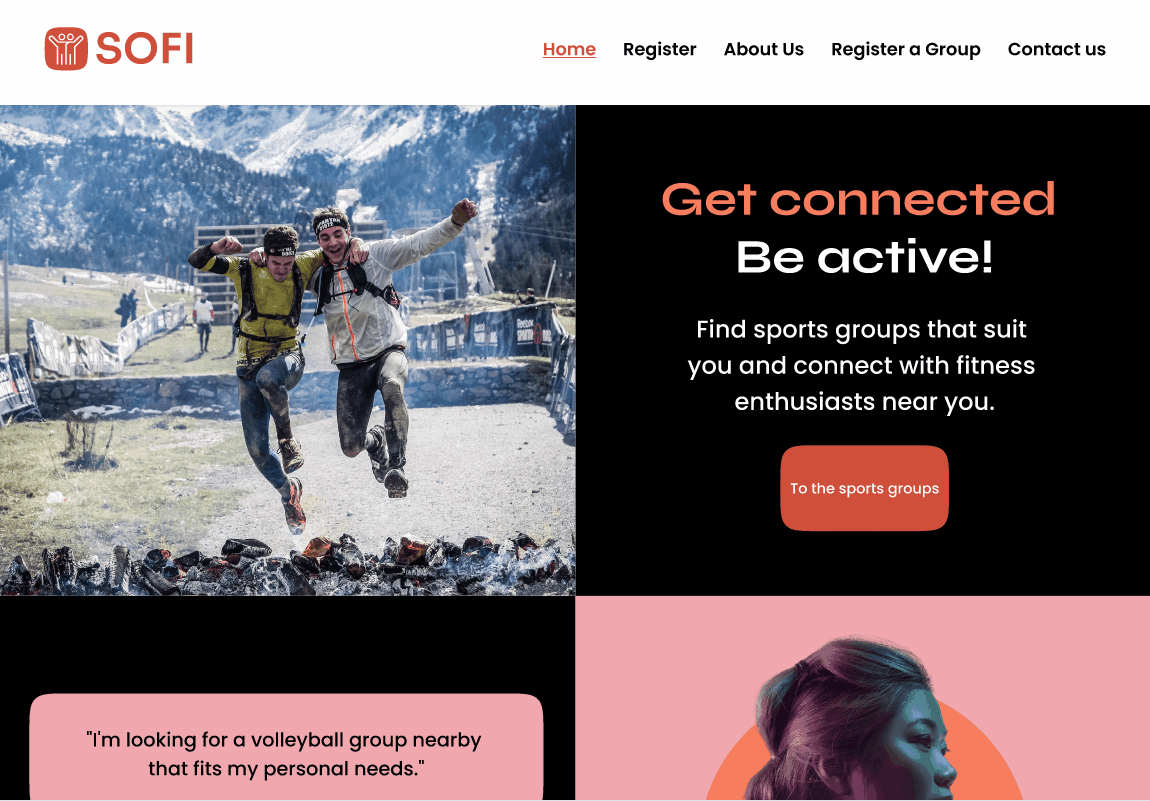
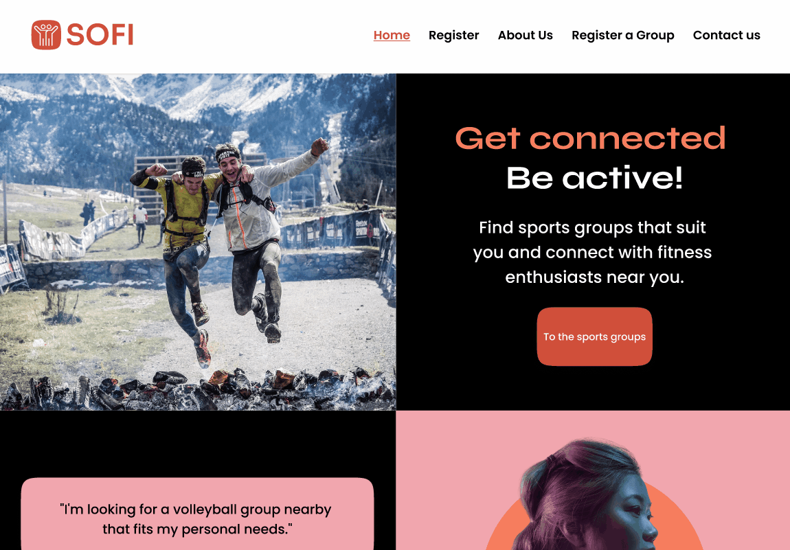
#1 Entry and onboarding
The homepage had to answer "What is SOFI?" immediately and help users take action without confusion. I designed a simple, responsive entry point where users could explore groups, register themselves, or create a group in just a few steps. The registration flow was intentionally lightweight, using email and OTP while showing only essential information to protect privacy.
#2 Discovering sports and joining groups
To help users find their community, the flow started with sport selection and then surfaced nearby groups by geolocation. Each group profile showed essential information such as members, level, schedule, and goals, making it easier to decide whether the group was relevant before joining.
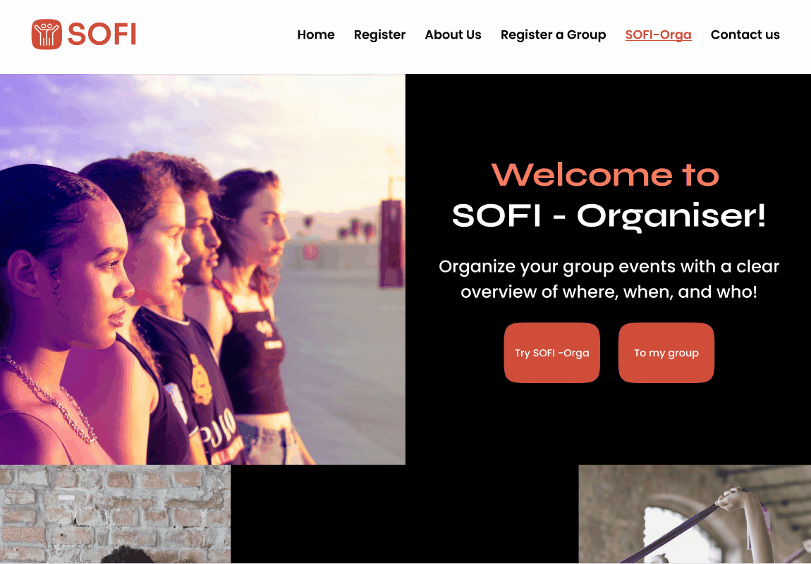
#3 Supporting organization within groups
To make group activity more sustainable, I also designed the SOFI-Orga feature, which allowed administrators to create events, invite members, and manage attendance more clearly. This helped move the product from simple discovery into real coordination.
WHY THIS MATTERED
Organizing the experience around these three moments helped turn the product into a clearer, more connected journey, from first entry to community participation and ongoing coordination.
Validation & iteration: Testing validated the core idea and revealed where the flow was still unclear
We tested the MVP with 80 students to understand which parts of the concept felt most useful and where the experience still created friction.
WHAT TESTING VALIDATED
The testing confirmed that finding relevant workout partners and communities was the most valuable and differentiating part of the concept. Gamification generated interest, but users saw it as secondary compared to the need to connect with relevant people first.
WHAT STILL NEEDED REFINEMENT
The sessions also exposed confusion in the registration flow and in the distinction between groups and events. Based on this, I refined the information architecture and simplified parts of the onboarding experience to keep the MVP focused and easier to understand.
WHY THIS MATTERED
Testing helped confirm the strongest aspects of the concept while also highlighting areas where the experience needed further clarity, resulting in a more focused and understandable product flow.
Outcome, learnings, and next steps:
The project validated the concept, but also clarified its limits.
OUTCOME
SOFI resulted in a clear MVP concept centered on social connection and helping users find relevant workout partners and communities. The final responsive designs and prototypes helped translate an early-stage idea into a product direction that was easier to communicate, test, and prepare for development. They also became useful assets for stakeholder and investor presentations.
WHAT I LEARNED
One of the biggest lessons was about market differentiation. Competing against platforms like Meetup, Facebook, or Strava made it clear that SOFI needed a sharper audience and a more specific value proposition. The research also suggested that the most promising opportunity might not be students under 25, but older users looking for connection, flexibility, and community through sport.
WHAT I WOULD DO NEXT
If the project had continued, the next step would have been to refine the audience strategy, simplify the relationship between groups and events, and test the product further with the over-25 segment to validate a more differentiated positioning.
REFLECTION
For me, SOFI was an important step as a designer because it was my first time leading the UX/UI process end-to-end as the sole designer. It strengthened my research skills, my ability to work closely with development, and my confidence in translating early ideas into product experiences that were both user-centered and technically realistic.
CLOSING THOUGHT
The project helped validate the core concept, but it also revealed that strong product ideas need clear positioning, a focused audience, and deliberate prioritization to succeed.
SOFI Mobile version


