Ticketswap
The challenge was to redesign several screens of the Ticketswap app. TicketSwap offers a safe, convenient, and fair platform for buying and selling tickets to concerts, festivals, sports events, theater productions, and day trips, making it a preferred choice for users worldwide. Based on previous usage, the aim is to enhance its visual appeal.
Project Summary
Role - UX / UI Design
Location - On Site
Team - Individual project
Design Tools - Figma
Timeline - 3 Weeks (June 2022)
Stakeholders - Ironhack Design Project


Opportunities for improvement: Overview of the previous experience
Building on the previous app design, the following areas have been identified for aesthetic refinement and improvement:
#1 Logo
#2 Homepage
#3 Discover event overview
#4 Categories
#5 Event & tickets overview
#6 Ticket purchase
The focus of this project will be on developing a new user interface for the areas listed above.
Redesign 1: Intro & Logo
Taking color psychology into account, the TicketSwap logo uses blue and white—colors known to evoke serenity and commonly used in industries such as technology, healthcare, and finance due to their associations with professionalism and reliability. To enhance a sense of modernity and sophistication, violet and navy blue were selected as TicketSwap’s primary colors, reflecting qualities of creativity, art, and refinement. These shades create a balanced expression of contemporary style, dynamism, and elegance—ideally suited for an event ticket exchange platform.

Before: Intro of the Ticketswap app with logo.

After: New app intro with new logo.
Redesign 2: Homepage
The home page presents several areas for improvement. While the design is clean and simple, the color palette feels overly cold, which lacks the vibrant atmosphere typically associated with an events app. The design could benefit from evoking emotions such as:
-
Joy
-
Excitement
-
Freedom
-
Community
-
Vibrancy
Additionally, the event card would benefit from a more dynamic color scheme to enhance contrast and readability, making event details more accessible.
The redesigned homepage now features a more dynamic color scheme, enhancing contrast to evoke a vibrant atmosphere and improve the readability of event details.

Before: Design of the app´s home page.

After: New design of the app's home page.
Redesign 3: Discover events
When tapping on 'Discover Events,' various events are displayed as simple icons, each showing the event date, name, and location. Incorporating images for each event could significantly increase user interest.
Images were integrated for each event to enhance engagement, allowing users to easily scroll down and access a comprehensive list of all events scheduled for the day.

After: New discover event screen design.

Before: Previous appearance of the discover event screen.
Redesign 4: Categories
When tapping on 'Categories,' users are presented with various event categories, each represented by a simple icon and name. Incorporating category cards with images for each category could greatly enhance the visual appeal and overall enjoyment of the user experience.
Images have been integrated for each category to boost engagement, enabling users to easily scroll down and access a complete list of all event categories.

Before: Original design of the categories screen.

After: New categories design.
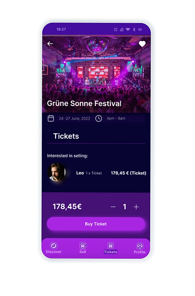
Redesign 5: Event & tickets display
When accessing event details and available tickets, information about already sold tickets is irrelevant for users looking to buy or sell a ticket.
In the new design, information about tickets that have already been sold has been removed, as it’s not relevant for users who want to buy or sell tickets.
After: New event information & tickets screen.


Before: Event & tickets overview.
Redesign 6: Ticket purchase
When choosing a ticket to purchase, information about tickets that have already been sold by the seller is not relevant to the user.
Information about tickets already sold by the seller has been removed, as it’s not relevant to users choosing a ticket to purchase.


Before: Ticket purchase overview.
After: New ticket purchase screen.
Why are we doing this?
#1 Improve the app's visual appearance
By adding vibrant colors and images, the app now feels more inviting and enjoyable, creating excitement as users browse for tickets.
The images also serve a practical purpose, giving users quick visual cues to identify events and connect emotionally. The new colors and dynamic design add energy that aligns with the ticket buying/selling experience. This refreshed look is clear, joyful, easy to navigate, and visually appealing.
#2 Eliminate irrelevant information for the user
Removing irrelevant information, such as tickets that have already been sold for an event or by a specific seller, helps keep the app focused and user-friendly. This streamlining ensures that only available options are shown, making it faster and easier for users to buy or sell tickets without distractions.
Final thoughts
User testing is needed to confirm whether the new app design encourages greater user engagement. Currently, all design choices are based on assumptions that need verification.
One of the most valuable takeaways from this project was analyzing the app from a user’s perspective and understanding how to design a smoother, more intuitive, and user-friendly experience. It helped me strengthen my analytical thinking as a designer and reinforced the importance of usability, clarity, and consistency in every interaction. This process also made me more aware of how even small design decisions can significantly impact the overall user journey.